Thursday, October 09, 2014

Ruby - Mobile Visual Diary


I think this is by far, the ultimate mobile visual diary. Granted, it may not be the most efficient or the most practical but it definitely is one of the most original ones I've seen so far.

Being in New Zealand, you get to see people touring up and down the country in converted vans, buses, wagons and 4x4s and more often than not, they will have some collage painted on the side. It's not uncommon to come across Bob Marley themed campers, dolphin themes, landscapes, unicorns and fairies, rainbows and all the imagery you can think of that will relate to traveling through beautiful New Zealand. However, most of these camper vans are rentals and you don't get the option of embellishing them in your own way, you just hope to get one that will have some graphics which will suit your taste when you rent them out. But it doesn't have to be that way.

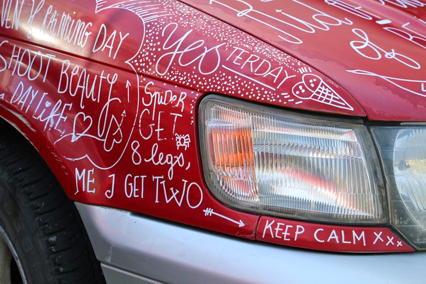
Meet Hylie & Maxime, a couple of french guys who have been flatting with me for the past 3months. These guys bought a car for their traveling period through both the North and South Island and have been using it to record their adventures. It's not only the places and experiences that they've had that  make their way onto the car but also thoughts and quotes. As soon as something interesting occurs, you can see the white uni posca pen jumping out of the glove compartment and leaving marks for posterity. Ruby, as they named their car, is not only a visual diary of their trip but also has a great variety of hand drawn lettering. They will be selling Ruby shortly and the lucky buyer will have the option of keeping it as it is or, if they want to start their own visual diary, they just need to wash the car with soap and they'll have a clean canvas for their own!


Sunday, September 28, 2014

Spring 2014


Spring has sprung once again but instead of posting pictures of tulips as I usually do, I decided to post a picture of my cactus, something closer to home. This little guy has 17 flower buds so far! I don't think I've ever seen a cactus with so many flowers at once. It's like spring has decided to announce its arrival with fireworks bursting into a display of color... hahahaha

I'm not sure if the tulips in the Botanical Garden were able to make a big impression this year. We had a couple of storms hit Wellington on the day that the Spring Festival started. I wouldn't be surprised if the tulips were badly battered.

Monday, August 11, 2014

Renee Coffey, North Island Rodie Tour, closing gig poster


This poster was specifically designed to celebrate the closure of the Renee Coffey North Island Tour, 2014. Using a warm color palette, the poster conveys the sensation of being in a warm lazy summer evening. The double exposure effect gives a certain feel of intimacy and introspection, which is well suited for this private event.


 Detail

 Original files


Left poster used for the duration of the tour. Right poster was an early conceptual design.

Friday, August 08, 2014

Making waves!

http://theroundupblog.com/

Just came across "The Roundup Blog... an online collection that delivers the web's most interesting content." (They're words, not mine ;) ).  I believe this is the first time my work has been published on a design blog without me having to submit it.  :D

Thanks to RoundUp for considering my work! Hit the link to see what other interesting and cool things they have put together.

Cheers guys!

THEROUNDUP


Winter day!


Today hasn't been particularly cold, in fact, it almost seems like everyday has been as cold as this one! That's not entirely true of course, we've been having some nice sunny days and they almost feel like spring... until the wind reminds us that we're only experiencing an illusion, hahaha.

Keeping myself warm at home, I look out the window from my "studio" and can see how it's hailing quite hard. Fifteen minutes later the sun comes back out and all traces of hail has disappeared except for the puddles on the street. Hail is always an event here in Wellington but will never compare to when it snowed a few years back, "a once in a life time event" they called it... unless you're like 90. That was an awesome day!!


Cool little video that captured the feeling of that day :)

Monday, August 04, 2014

AMN5

Fifth International Conference on Advanced Materials and Nanotechnology


The MacDiarmid Institute organizes an International Biennial Conference that offers a broad interdisciplinary overview of advanced materials and nanotechnology, and provides an exciting forum to discuss new and exciting advances in the field.


The logo for this event had to depict the fact that the conference was taking place in New Zealand. It also had to include the concept of nanotechnology and/or advanced materials, which are the main areas in which the conference focuses on.

In order to address these requirements, the proposed solution had a representation of New Zealand created by organic forms, round, curvaceous elements that seem to meld together for a specific purpose. The repetition of these elements can then devise organized structures, by which, the concept of having advanced materials or nanotechnology has been achieved.


Applications of logo and secondary elements on assorted
conference materials. This part of the project was undertaken
by the conference organizers.


Friday, May 23, 2014

From Molecules to MIlk | Interface magazine cover

Over the past few weeks, I've been working on my portfolio over at Behance and realized that there were some projects that I never published on my blog before. So I intend to correct this situation by posting them now. It will be an ongoing process but it should be all here soon.
The MacDiarmid Institute for Advanced Materials and Nanotechnology publishes their own magazine where they highlight the latest results to come out of their research. Interviews and special articles on the people behind the innovations are also part of the magazine.
This issue, Interface 21, was a milestone since the magazine went through a complete redesign and I was lucky enough to be called upon to work on the cover. I had to hunt down an old milk bottle from a thrift shop so I could photograph it for both the cover and the article. Fortunately it was only a 10 minute walk down the street and even had the chance to choose which bottle I wanted. The idea was to have a vintage look and the combination of hand drawn fonts and a blackboard texture for the background was ideal for this purpose. The dark background also helped to make the milk bottle and the title to stand out.

Here's a bit of the process the magazine cover went through.


Thursday, May 15, 2014

Snowaka | Custom snowboard skin design


This post is related to a previous entry I made back in 2010, however, I never really took the time to describe what was going on. So I think this is a good opportunity to talk about the snowboard project.

My friend Rachel Halfpenny is an avid snowboarder and is addicted to the powdered slopes. As soon as snow falls at Mt Ruapehu, you can see her gliding down with a plume of snow racing behind her. She will get up at the crack of dawn and drive the 4 hrs to the mountain, snowboard for as long as the light permits, get up early the next day, hop on her board and spend a few more hours making tracks and then drive four hours back home... that's dedication!

It was only natural that she would want to personalize her board, to capture her personality and reflect who she is. This board was the end result. Her fun and happy personality can be seen in the cartoon of her but also her pride for her English heritage, the emblem and the St George's Cross is a dead giveaway.

You may be asking yourself where the word Snowaka came from or what it means. It's a play from the word snow and waka (maori name for canoe). So essentially she rides her snow canoe, hahaha. However, phonetically it could also be "snow walker"... clever huh?


Tuesday, May 13, 2014

Ephemera


Wasn't sure which version was the best so decided to post both of them. Which one do you prefer? These illustrations have been developed from a sketch I previously published, Ephemera.

Always fluttering at the edge of my dreams, never being able to really grasp her.

Tuesday, March 11, 2014

Renee Coffey - North Island Roadie


Summer! Nothing like hitting the beach, catching some waves, drying yourself under the sun and then relaxing in the evening listening to some cool live music. If you find yourself in the North Island of New Zealand during the month of March, you might as well catch one of Renee Coffey's gigs. She'll be hitting most of the surf towns on her tour, so soak in the sights and listen to some good tunes while you're at it. Proceeds will go to Renee's charity called Running with Purpose which works through World Vision.

I am stoked with the way it turned out! This poster looks awesome in a large format version, the colors are so crisp that it really stands out. I think the illustration I made pretty much captures the idea of the tour. I also designed a special version that will be used to commemorate Renee's final concert when she comes back home. Until then, enjoy!


Monday, March 10, 2014

Highlights and Shadows


I am really pleased with the result of this illustration, I like everything about it. Starting from the texture and color of the paper up to the way the highlights and shadows give the contours and volume of the face and body.

With a bit of imagination, you can almost see Princess Leia's iconic hair-do.

Friday, March 07, 2014

And now for something different...


I thought it would be a good time to try something different from my usual type of illustrations. For a first attempt at obtaining a water color effect, I think it was alright. However, I can see lots of flaws and I definitely need to practice a lot more. There are some areas where there are some nice highlights but most of it is quite flat. This was done using photoshop but I'd like to give it another go with real watercolors next time. Oh well, back to the drawing board I guess.