Tuesday, May 31, 2011

Sleep


Lately I've been having the help of a fantastic model who not only is extremely patient but also pushes me to do these sketches more regularly. I've been spending so much time designing with the computer on a specific project that sometimes it's really refreshing to sketch something just for the fun of it. It doesn't really matter how rough the result is, it's just practice and a way to get back to basics.

Sunday, May 29, 2011

Unexpected


This is a rough version of something I'd like to spend more time on. However, the hours I spent on this sketch has been more than you could expect. It actually took me several days to get to this result. I'd advance a lot on some days but on others it felt like I was hardly accomplishing anything. I'm still not sure about the background though, I'll have to play around a bit more and see if this will stay. It seems like the lines in the back are giving the illustration a confined feel to it. I'm looking for a more relaxed atmosphere. Love the textures though!

Tuesday, May 24, 2011

STORK


This is a logo I created a few weeks back for an entity within Stanford University that focuses their research in kids. Unfortunately I can't remember exactly which Department was in charge of this project but it might be the Neonatal and Developmental Medicine within the School of Medicine if I'm not mistaken. In any case, the idea was to develop a logo that fell in line with the Stanford seal. 

The color used isn't the official Cardinal (Pantone 201) but that can be fixed at the time of printing. I'm really impressed that you can easily find the Design Guidelines within the Stanford website. It can be a nightmare trying to find official emblems or logos for presentations, posters, etc within some universities.

Monday, May 23, 2011

Syudent Symposium 2011


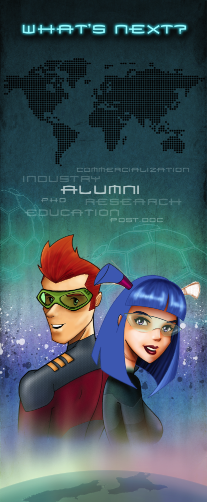
W.I.P. Here's the illustration I've been working on these past few weeks, it will be used to identify the Student Symposium that the MacDiarmid Institute organizes each year. On this occasion, the theme of the Symposium focuses on the options that Alumni encounter after focusing on their studies.

The characters depicted here are the same that have been used for the previous Symposiums although there has been an evolution. You can notice that the characters seem more mature, the style of drawing although far from being realistic, is less caricature than previous versions. Elements from the previous years have been used and incorporated in order to have a sense of continuity.

There are a lot of details that still have to worked on before I can consider this illustration as completed, however, I'm really stoked with the result so far. It's quite fun to see how everything begins to fall into place, especially when you only have a rough idea of what you want to accomplish.

Previous Student Symposium illustrations: