Showing posts with label color. Show all posts

Monday, August 11, 2014

Renee Coffey, North Island Rodie Tour, closing gig poster


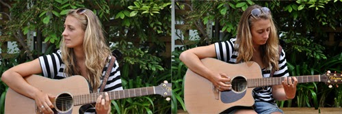
This poster was specifically designed to celebrate the closure of the Renee Coffey North Island Tour, 2014. Using a warm color palette, the poster conveys the sensation of being in a warm lazy summer evening. The double exposure effect gives a certain feel of intimacy and introspection, which is well suited for this private event.


 Detail

 Original files


Left poster used for the duration of the tour. Right poster was an early conceptual design.

Friday, March 07, 2014

And now for something different...


I thought it would be a good time to try something different from my usual type of illustrations. For a first attempt at obtaining a water color effect, I think it was alright. However, I can see lots of flaws and I definitely need to practice a lot more. There are some areas where there are some nice highlights but most of it is quite flat. This was done using photoshop but I'd like to give it another go with real watercolors next time. Oh well, back to the drawing board I guess.

Friday, July 05, 2013

Holding


I have just read a blog in which a couple decided to do an experiment in which they had to hold their hands for 8 straight hours without letting go once. Now that sounds a bit extreme but it's a no easy challenge. I once did a similar thing for a movie promotion I was in and it's a very interesting experience. It's a trivial thing to do, to hold hands or to hold somebody close, yet we don't tend to do this with anybody. Occasionally we'll do it with strangers because we want to show that there's some kind of support or unity for a cause, but when you do it with somebody you know, there's much more meaning to this simple act. We don't give it much thought really but there's a lot of meaning to just holding hands as a couple. Apart from reflecting intimacy and closeness with each other, there's connectivity and support. You show that you're at ease with that person and that you accept them as they are, even if there may be some traits you dislike. There's even more to just holding hands that we don't realize, maybe it's over thinking the whole situation but we tend to have a certain preference as to the way we hold hands and which hands we use. If both people involved are right handed or left handed, one of them will have their "useful" hand engaged and then you get into who's the dominant person in the relationship and other issues. I had never thought about too much about this. Who knew that a simple act as holding hands had so much meaning? So maybe next time, when I'm in this situation I'll be more aware of what's going on in the background... Or maybe not, and I'll just enjoy the company and warmth of the person I have next to me.

Monday, May 06, 2013

Latest sketch


This is week two of being self employed and it has been a bit difficult to get into a proper schedule. However, this week has been much better than the previous one, I'm a bit more focused and trying to stick to "work hours". The problem is, since I don't have to leave home in order to get work done, I find myself leading a very relaxed schedule.

In any case, waking up every day and feeling less stressed is an improvement that I embrace effusively. I'm also making an effort to improve my drawing skills and this is the first sketch that I've done, hopefully in a month's time I'll be able to see a difference. Not trying to run here but I assume I will have more time to do things that I really like.

We'll see how it goes!

Sunday, September 09, 2012

Spring Fairy


Practicing with some brushes, trying to get a watercolor effect. The end result is quite nice although didn't quite obtain the effect I was after. Definitely need more practice. I do like the tones of the skin though, nice and peachy! It's spring finally and a fairy seemed like a good idea to draw :)

Saturday, January 21, 2012

Nom nom nom!


After viewing the last entry I decided to post a few more shots of food. I don't normally take pictures of every meal I eat but every now and then, if the plate has a nice presentation, I will try to take a nice shot. All of these pictures have been taken on the fly, meaning that there has been no special lighting nor any special preparation. Most of the times, when I take pictures of food, it will be because I'm covering some special event and there's some catering service involved. I've been asked if I get to enjoy the delicacies presented before me and normally I don't have time to savour them. Either I'm too busy trying to get a nice action shot of people in a candid atmosphere and I don't notice the food disappearing or I just scoop it in so I can continue with the shoot. My bad!

Sunday, November 06, 2011

Sassy


This last illustration had been in the works for quite a while. I first drew the sketch about a month ago and it's only until now that I've finished it. If I were to be really critical about this piece, I'd have to point out that the neck is extremely long and that the alignment of the head is pulled too much to the right side of the body. However, since I'm not being too critical, I like the final result.

Originally, the magenta top had no texture and it really jumped against the background. Adding that dirty texture helped ti subdue the effect and I believe there's a better balance overall.

Needless to say, I always have the help of a special person that inspires me to draw these illustrations. Even though it is not a close representation of the actual person, it is based on her.

Friday, October 07, 2011

Spring Festival 2011


Our clocks have been move forward and the tulips have been blooming for a couple of weeks now, so I guess it's safe to say that Spring has finally arrived. This year's end of winter was pretty crazy, we saw snow in Wellington and not only around the tops of the hills, but even at sea level! The last time a thing like this happened was 50 years ago. Really looking forward to warmer and more stable seasons.

As usual, the Wellington Botanical Gardens have a variety of tulips on display to mark the arrival of spring.

Thursday, October 06, 2011

Steampunk sketch


It's been a while since the last post and many things have occurred. I'll put a few things up in order to catch up with what's been going on but in the meantime, here's a sketch I just finished today. I originally penciled it in the 16th of September but only colored it until now. Wasn't too sure about the color of the pants but I settled for this brownish grape tone in the end. The other possibility would've been a dark grayish olive green. Hahaha, I guess it would be easier if I told you the Pantone values.

Enjoy!

Thursday, June 23, 2011

Student Symposium 2011


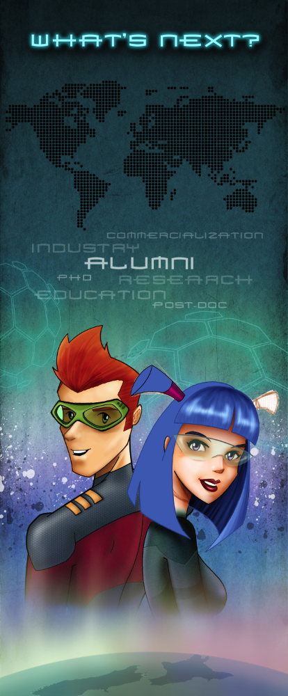
The illustration for this year's Student Symposium organized by the MacDiarmid Institute is finished! It seemed that every time I felt it was completed, I wound find a little detail that needed a bit more of work. There might be a few flaws still but I'm quite satisfied with the end result. If I keep working on this I'm sure that I'll keep finding other things that need to be touched up.

I wonder what next year has in store for me. What will the theme be and how will I be able to incorporate these characters. I think that MESA (The MacDiarmid Emerging Scientists Association) will be in charge of future Symposiums.

Wednesday, June 08, 2011

Asleep


Another sketch made possible thanks to my ever patient and inspiring model, hahaha. The face needs to be tweaked a bit more so you can count on seeing an updated version of this sketch some time soon. Overall though, the colors, the lighting and the shadows turned out to be quite acceptable. Having a great time making these sketches!

Unexpected: Updated


After a few changes to the previous version I think I have found a result that keeps me happy, for now. In the previous version, the lower part of the body got lost due to such dark colors. With the change of color to a burgundy tone, the body actually stands out more and you have a lighter feel to the illustration. It doesn't feel so cramped in a sense.

Regarding the background, I'm still not quite sure which option is the best. I can't decide which one to pick. I might need to come back to this in a few days to get a fresher perspective. These are the other ones I had in mind anyway.


Tuesday, May 31, 2011

Sleep


Lately I've been having the help of a fantastic model who not only is extremely patient but also pushes me to do these sketches more regularly. I've been spending so much time designing with the computer on a specific project that sometimes it's really refreshing to sketch something just for the fun of it. It doesn't really matter how rough the result is, it's just practice and a way to get back to basics.

Sunday, May 29, 2011

Unexpected


This is a rough version of something I'd like to spend more time on. However, the hours I spent on this sketch has been more than you could expect. It actually took me several days to get to this result. I'd advance a lot on some days but on others it felt like I was hardly accomplishing anything. I'm still not sure about the background though, I'll have to play around a bit more and see if this will stay. It seems like the lines in the back are giving the illustration a confined feel to it. I'm looking for a more relaxed atmosphere. Love the textures though!

Monday, May 23, 2011

Syudent Symposium 2011


W.I.P. Here's the illustration I've been working on these past few weeks, it will be used to identify the Student Symposium that the MacDiarmid Institute organizes each year. On this occasion, the theme of the Symposium focuses on the options that Alumni encounter after focusing on their studies.

The characters depicted here are the same that have been used for the previous Symposiums although there has been an evolution. You can notice that the characters seem more mature, the style of drawing although far from being realistic, is less caricature than previous versions. Elements from the previous years have been used and incorporated in order to have a sense of continuity.

There are a lot of details that still have to worked on before I can consider this illustration as completed, however, I'm really stoked with the result so far. It's quite fun to see how everything begins to fall into place, especially when you only have a rough idea of what you want to accomplish.

Previous Student Symposium illustrations:

Sunday, April 24, 2011

Allegro


Slight modification to a previous entry entitled Reflectere. Even though I was really pleased with the results obtained then, the feeling it portrayed was that of emptiness. This second version has a totally different feeling, needless to say, a feeling of warmth, presence and happiness can be perceived. Not only is this shown through the facial expression but can also be seen through the warmer color pallet that has been used. Also, this looks more like the true nature of the one who has inspired me.

Here's the previous image: